
A new home
for Seena Labs.
We redesigned our website to show how Seena turns everyday behavior into a deeper understanding of people.
Scroll to read the case studyThe question on your mind.
Right on our homepage.
Our hero puts words to the question that brings people to Seena. Behind it, human figures move beyond textured glass: present, but hard to read. It reflects the distance our visitors feel from their own users—people they can see in the data, but struggle to understand. Seena Labs helps close that distance.
Follow the signals.
See the understanding.
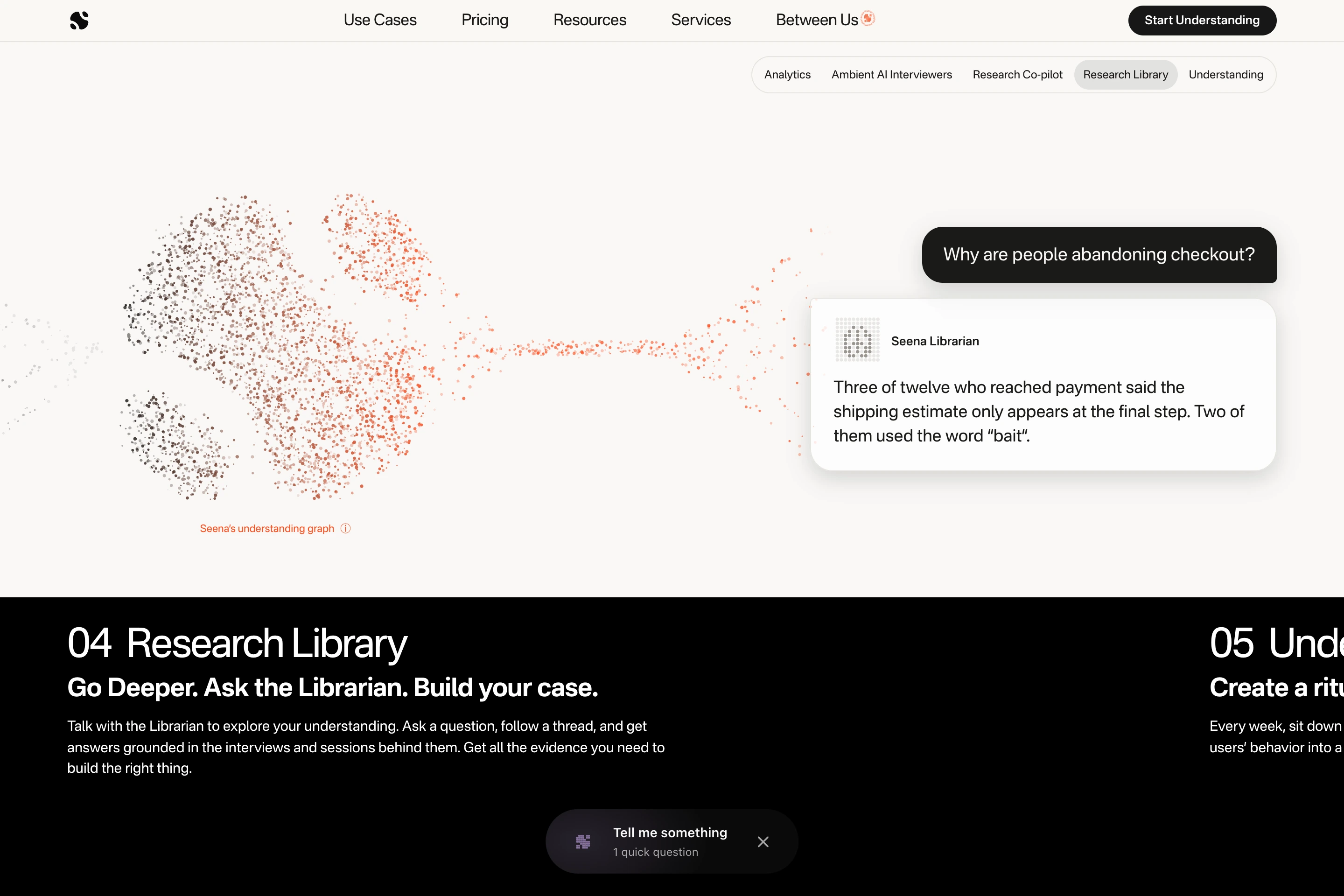
The product story unfolds as you scroll. Behavior becomes interviews, then an understanding graph, research, answers, and a weekly briefing. The same particles connect the chapters.
Keep this
Between Us.
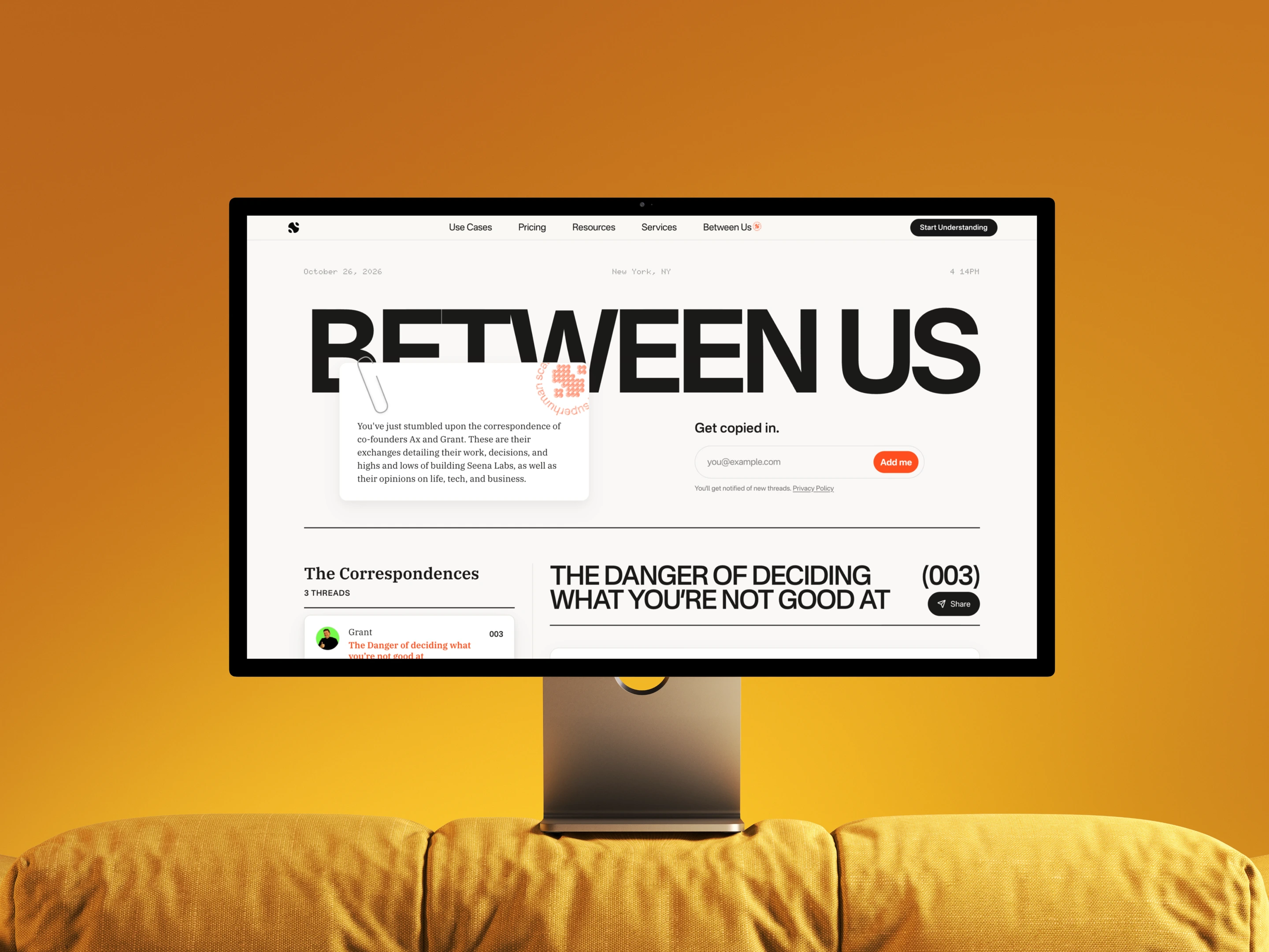
A different pace for the correspondence between Ax and Grant. A paper note, a circular stamp, and an oversized masthead give the letters their own place within Seena.
21.9% visit on mobile.
100% of the experience.
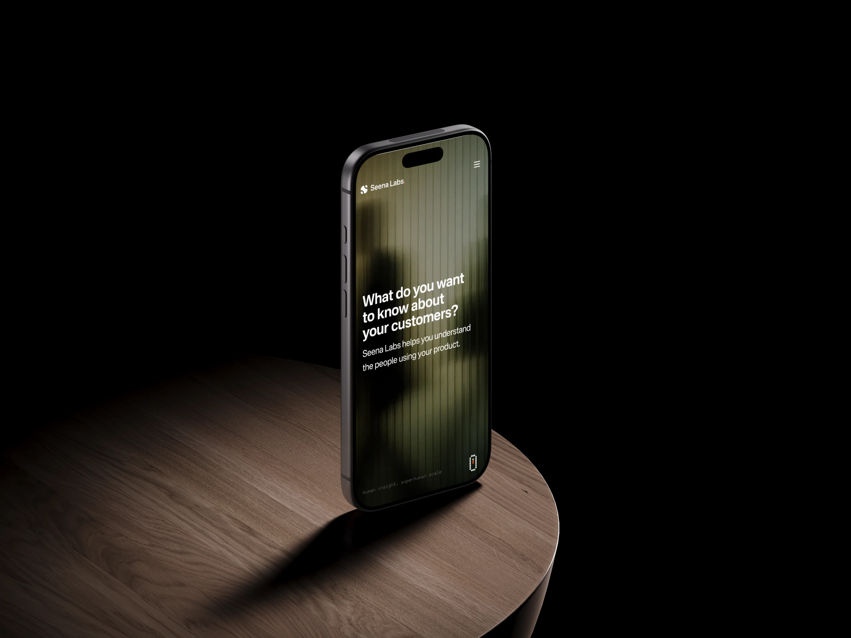
21.9% of our visitors use a mobile phone. We optimized every chapter for them—from full-screen navigation to scroll-driven illustrations. The whole Seena story, made for the palm of your hand.
One visual thread.
The particles aren’t a separate decoration. They carry the story from the graph into the cards and answers. Typography and the orange accent connect that moving illustration to the rest of the site.
A new home.
The same curiosity.
The new site brings our product, research, and correspondence together. Take a look around. We’d love to know what you think.
Explore Seena Labs ↗Seena Labs · October 26, 2026